

Scrolling Panels
A defining feature of Articulate Storyline and Adobe Captivate courses is that are almost exclusively slide-based. More than likely, if you are reading this article, you have experienced a slide-based course at some point in your life. They have been the dominant style for eLearning courses going back to the very inception of authoring tools.
These slide-based courses require learners to click and click and click, and just when you thought you’re all clicked out, there’s more clicking!
It’s no wonder that new authoring tools like Articulate Rise 360, Elucidat, and Adapt Learning are becoming so popular. These new authoring tools have more of a “website feel” and are generally more scroll-based than slide-based.
While these new tools are breath of fresh air, they are much more limiting for the developers than Storyline or Captivate.
So…
Can an eLearning course built in Storyline look as cool and modern as a course built in Rise?
The answer is… Yes, the scrolling panel in Storyline can be used not only to modernize courses but to at last eliminate endless clicking!
Here’s an example of how we incorporate scrolling panels into our storyline courses.

Video Backgrounds
Tired of pulling from the same old stock images to build your compliance courses or onboard training?
I know that we are! That’s why we’ve started using video backgrounds to make our courses more engaging and give our learners something completely new.
But wait… Aren’t video backgrounds are distracting?
Well, yes video backgrounds do have the potential to be distracting and if used in the wrong way can take away from the learning content. That’s why when it comes to backgrounds in eLearning courses, we like to use video with subtle movements. If done correctly, subtle movement can add a lot to overall aesthetics of an online learning experience.
Another great benefit of using video background in eLearning courses is you can demonstrate an action that you want your learners to emulate. In the example below, learners are encouraged to learn new collaboration skills. The video background shows a group of productive wo-workers collaborating in a meeting. Our goal for using a video background in this situation goes beyond aesthetics and actually shows the learners what collaboration looks like.
Here is a simple example of subtle video being used in an eLearning course.

_________________________________
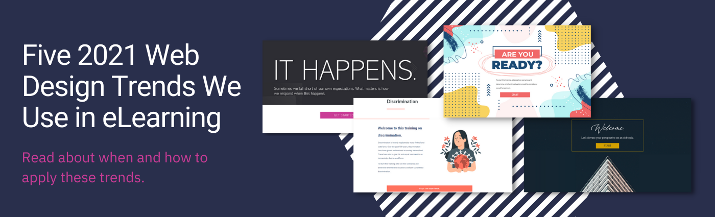
If you're interested in learning more about using video to modernize eLearning, then check out this article about web design trends that our team uses to develop beautiful eLearning courses.
_________________________________
GIFs
If a picture says a thousand words then how many words does a GIF say? We aren’t really sure, but it’s safe to say… a lot!
It's easy to see why we love to use GIFs to give directions in our eLearning courses.
You could add text to a course telling learners to “scroll down” and “click this button for extra resources”, or you could simply add the right GIF. Sure, learners might be taken off guard the first time they see your “bouncing scroll mouse” but once they see it once they’ll know exactly what todo going forward.
Adding a few GIFs can limit clutter on a page, increase white space & readability, and even earn you some User experience bonus points.
We won’t give away our favorite GIFs, but we will give you a great resource to build your own!
Check out Loading.io, a cool tool that we use to add basic movements to icons.


Wide Screen Dimensions
We love to use wide screen dimensions whenever we know that our learners will be taking a course from a desktop.
*If you’re building a course that needs to be highly responsive for mobile devices then this may not be the right trick.
Storyline courses that are built to be responsive generally use a 4:3 ratio and in fact this is Storyline’s default size. However, a 16:9ratio fits better on most computer screens and gives a course more of a modern feel than 4:3.
Another simple trick that can help modernize Storyline courses is to make the background theme white.
Here is an example of a slide built in both 16:9 and 4:3.
Wide Screen 16:9

Narrow Screen 4:3

Natural Animations
By natural animations, we mean animations for text, images, and backgrounds that are simple and help guide the learner in the right direction.
Flashy animations tend to stand out too much, to the point where they can look tacky. We like to use a subtle fade or wipe, timed perfectly in order to guide the learner’s eye towards the right direction.
Here are a couple of GIFs that demonstrate how we use simple animations to both modernize our courses and guide the learner along a pre-determined pathway.


