
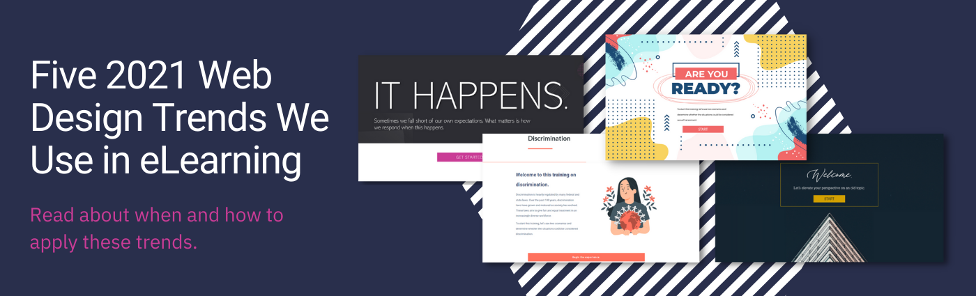
One sad/exciting element of all design is that most designs we created five ago now appear completely outdated. Staying current with design trends not only leads to content that “looks great and modern” but contains new functionalities and technologies that emerge over time. Here are some current web trends that have influenced our training design this year.
One sad/exciting element of all design is that most designs we created five ago now appear completely outdated. Staying current with design trends not only leads to content that “looks great and modern” but contains new functionalities and technologies that emerge over time. Here are some current web trends that have influenced our training design this year.
Jump straight to the trend you're interested in.
1. Whitespace

Websites are continuing to embrace whitespace. Whitespace is any blank area between all different types of design elements. Whitespace helps to provide balance aesthetically to your content, making it easier to consumer and read.
Obviously white space can be white, but it can also be any other color that includes spacing and margins to give breathing room to content. Whitespace can give room to typography, free-floating images, video, and overall just creates a visually clean space. After using white space the remaining visuals appear to be bold, colorful, and important.
When to use in training: We use whitespace when we have a large amount of content/text to read. It can emphasize anything inside of it. Whitespace creates a canvas with breathing room to comprehend and absorb a large amount of text.
2. Motion

Our eyes tend to gravitate toward any moving element or object. Movement can both draw the eye towards something and make a point. Motion can include video, animation, or any other type of moving graphics. Motion grabs readers’ interest especially ones with decreasing attention spans.
Movement can dictate how a visitor or reader perceives a certain page or site. Forms of motion can include items as small as micro-animations or typography, all the way to full-screen video.
When to use in training: We use motion in animated gifs for a small/light movement in lists to emphasize the differences between content. We also use looped videos behind text to tie an emotional response to the text on top. There are many ways to effectively use motion in your design, it is just important to be strategic in your placement and not overdo it.
Decide what areas you would like to draw the most focus to and be mindful of that in your design. Be strategic with motion as too much can be distracting.
3. Massive Font Sized Heroes

One trend is needlessly large typography you can read across a room. This is most commonly used in the “hero” section (the topmost prominent section of a site) to draw attention and create visual emphasis.
Most often these headings use a sanserif font with simple easy-to-read bold fonts. The use of this feels contemporary and modern, at least for now.
When to use in training: We use large or bolded text for introduction and transition slides/screens. We also sometimes use them for titles or headings that divide a section of learning. If they are strategically placed, they can be very effective. Don’t use too many, as it can be very distracting.
4. Geometric Shapes

Shapes are just squares and circles right? Not really. It just so happens that this current trend is very useful for training design as well. Geometric shapes are simple and powerful for designers trying to draw you into a composition. It’s commonly used to divide sections, emphasize a point, or even explain a process.
Just because it’s “just a shape” doesn’t mean you can’t play around with it. If you soften the shape it can create a glow effect that’s futuristic. Shapes created from nature scenes provide inspiration and a modern twist.
When to use in training: We primarily use geometric shapes to separate ideas on a page. They can have a great impact visually on a project if done strategically.
5. Enhanced Image Treatments

Imagery can get across a lot of information in a training. It can emphasize a specific point, teach a principle, or evoke a feeling. Images have always presented unique design opportunities.
Creating certain images inside shapes, making them black and white, adding a strong gradient on top, adding shadow behind them, and more, can all enhance and draw attention to particular information. More and more, images are being treated to emphasize the message they are trying to get across.
When to use in training: We use enhanced image treatments to increase professionalism, or emphasize ascertain area/point on an image. The opportunities are endless if the enhanced images are strategically placed and used.


